Overview
Complete rebrand for Yida CNC, a Taiwanese precision machining company. Identity development, gradient system, typography, 3D asset framework. All designed for production constraints: CNC fabrication, material limitations, multi-surface reproduction.
Discipline
Identity · Visual systems · Art direction · 3D Asset framework
Client
Yida CNC
Location
Taichung, Taiwan
Date
2019–2020
Team
Parametric design lead (client) · CNC machining lead (client) · rendering/visualization support
Role and scope
Lead brand designer. Complete identity system including logo, gradient, typography, application templates. Coordinated with CNC teams.

The problem
Yida CNC had industrial credibility but no consumer-facing identity. The existing logo lacked energy for consumer products. Identity had to work from a 24-pixel favicon to 2-meter metal signage. Gradients and metallics had to reproduce reliably across screen, print, and CNC-machined materials.
Art direction
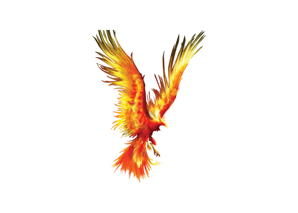
Gradient shows heat and energy. 3D renders show what CNC machines actually make: sharp edges, anodized finishes, tight tolerances. No fake materials or impossible surfaces. Lighting shows machined details clearly. Geometric shapes emphasize precision. The brand looks like what the company does: engineered, accurate, bold.

Color palette
The Phoenix gradient engineered for gamut, contrast, reliable reproduction. Golden yellow to deep red. Gradient calibrated for three contexts: screen (sRGB), print (CMYK), physical materials (anodized aluminum, powder coat).
#FFCE06
#AF262F
#303030
Typography
Accent (modified) as primary typeface. Geometric structure communicates precision, and softened edges add sophistication.Reusable templates ensure brand consistency without constant designer oversight.
Accent normal
Sphinx of black quartz, judge my vow.

The Phoenix logo combines a stylized feather with a precision-engineered wordmark. Form built from geometric shapes, translating cleanly to CNC machining specifications. Lockup variations ensure legibility from favicon to signage. Mark tested across materials.
01
Identity system
02
Manufacturing validation
Every identity element is validated for CNC production before finalization. Feather mark translates to toolpath specifications. Gradients tested on anodized aluminum and powder-coated steel.


03
Parametric prototype
Parametric model designed as phoenix feathers, CNC cut from aluminum. Physical demonstration of the brand translated into three-dimensional form.


Challenges
Balancing intensity and refinement. Scale flexibility required careful engineering. Phoenix had to complement the existing Yida CNC industrial brand.
Insights
Brand design for manufacturing requires production thinking from the start. A systematic approach accelerated internal adoption. Treating physical production as a design requirement integrated brand and manufacturing operations.